
The web app is now built for your phone
We have overhauled the TradeSoft web app on mobile: responsive layouts throughout, a proper slide-out menu, and a pile of visual fixes for anyone browsing on their phone.
Why we did this
TradeSoft is a mobile-first marketplace, and the iOS and Android apps are still the best way to use it. But the numbers are clear: a decent chunk of you open the web app on your phone anyway. Quick look at a listing from a link someone sent you, checking your watchlist on a break, a browse on a device that doesn't have the app installed.
Up until now that experience was very much built for a desktop screen first, and it showed. So we have been through the web app properly and made it work the way you would expect on a phone.
Menus that actually work on a phone
The biggest change is navigation. On smaller screens the top nav now collapses into a proper slide-out menu, with everything sized for thumbs instead of a mouse pointer.
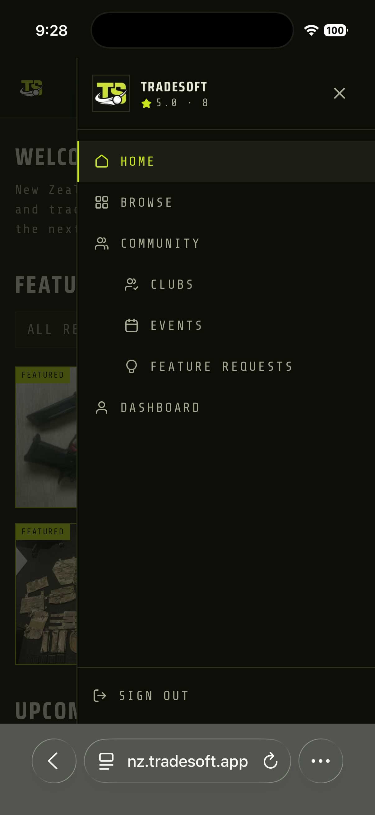
- Nested sections. Community expands to show Clubs, Events and Feature Requests, so you can get to the deeper parts of the site without hunting for them.
- Bigger tap targets. Menu rows, buttons and links are sized for fingers, not cursors.
- Clear current page. Where you are is highlighted, so you don't lose your place.
- Sign out where you expect it. Pinned to the bottom of the menu rather than buried.
Responsive layouts throughout
Beyond the menu, we went page by page and fixed the layouts that were assuming a wide screen:
- Browse and listing pages reflow properly on narrow screens, with images, prices and details staying readable instead of getting squeezed.
- Dashboard areas (your listings, watchlist and profile) stack sensibly rather than forcing you to scroll sideways.
- Forms and filters are easier to fill in on a phone, with inputs and controls at a usable size.
- Tables and lists that used to run off the edge of the screen now fit.
Plus a pile of visual fixes
A long tail of smaller things came out in the wash: overlapping text, cut-off buttons, images stretching out of shape, awkward spacing and a handful of elements that simply sat in the wrong place at phone widths. Individually minor, collectively the difference between a site that feels built for your phone and one that doesn't.
For the full experience, the apps are still where TradeSoft is at its best. Grab TradeSoft on iOS or get it on Google Play for Android. But if the browser is where you are, it now works properly there too.